Los Angeles Clippers unveil major rebranding ahead of new arena debut
NBAMonday, 26 February 2024 at 15:16

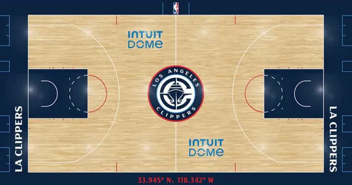
In a move set to redefine the identity of one of the NBA's most iconic franchises, the LA Clippers have announced a sweeping rebrand ahead of the opening of their new arena next season. The transformation isn't merely cosmetic; it represents a profound shift in the team's visual identity and reflects a deep commitment to its future.
Central to the rebrand is the unveiling of a new primary logo, which features a sleek and modern design incorporating a ship within a stylized "C". This emblem not only pays homage to the team's maritime roots but also symbolizes strength, resilience, and a forward-looking spirit. Alongside this, the Clippers will introduce an alternate logo, showcasing a stylish rendering of "LA" with the 'A' elegantly perched atop the bottom portion of the 'L'.
Read also
However, the changes extend far beyond logos. The team's color palette has undergone a significant evolution, with a shift towards a more sophisticated blend of tones. While blue, red, and white remain integral to the Clippers' identity, a rich navy blue will take center stage as the primary color. Complemented by accents of red, white, grey, and the introduction of a vibrant power blue, the new color scheme reflects the team's dynamic and diverse fanbase, as well as its aspirations for success on and off the court.
Notably, the Clippers deliberated on the possibility of altering their franchise nickname, considering various alternatives. Yet, a resounding sentiment emerged from fans, demonstrating a deep-rooted attachment to the historic "Clippers" moniker. Steve Ballmer, the team's passionate owner, acknowledged the feedback, emphasizing that while focus groups provide guidance, the ultimate decision rests with the organization. "The focus groups are advisory, not definitive," Ballmer stated in an interview with ESPN. "But I still listen to them, and I have heard, partially to my surprise, that there is no interest in a name chang

ESPN (from Los Angeles Clippers)
claps 0visitors 0
Loading


